Ten tips to improve conversions on your website and so increase your revenue
Many factors reflect your Website conversion rate, the trust in your brand, the website design and attracting the right people to your site. Once you get them there, you want to ensure that you have optimised your Website for maximum sales.
This post shares ten things you can do on your Website to help you get started, steadily increase your website conversion rate and improve your turnover.
1) Improve your imagery
The most crucial aspect of your product page is the photos; poor quality grainy photos will make the visitor lose trust in your brand. A brand product photographer can do wonders here, but if you don't have the budget for that yet, ensure the photos are bright, well-lit and sharp, keeping consistency throughout your Website.
Make sure more than one photo, showing different angles and a video if possible so they can get a feel for your product.
When uploading the images to your Website, ensure they are in the correct format (usually jpg) and are the right size; as a rule, they should be a maximum of 1000px wide unless they are covering the entire width of the screen, and then you should keep them under 2000px wide. You can also use a tool like TinyPNG to compress your images before uploading to get the smallest size whilst maintaining quality.
2) Show Social Proof
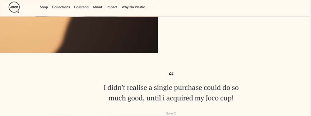
Social proof helps the visitor to trust in your experience or products. It could be case studies, testimonials, star ratings or a carousel of past client's logos. If you don't have many reviews yet, place one beautifully designed one there, like here on JoCo.
Over on the Amy Porterfield site, she has a 'Featured In' section that shows the different magazines she's been featured in, another form of social proof.
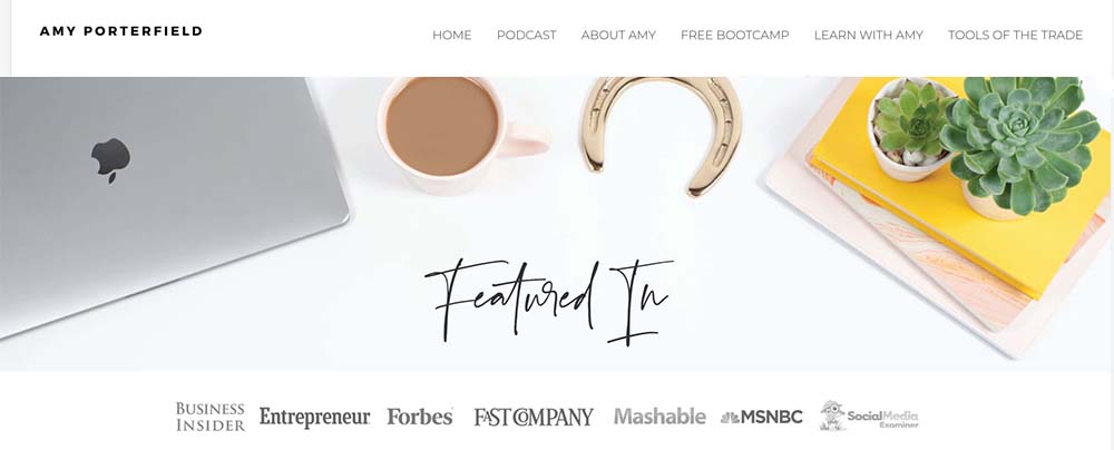
And then she's saying she's a 'top-ranking podcaster'. If all these people think that her podcast is worth five stars, then that's great social proof for her and her business, and obviously for her podcast as well.
![]()
3) Create Urgency
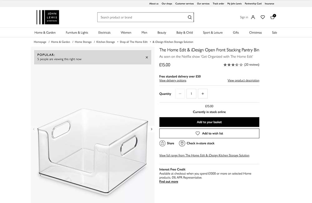
The best way to get a visitor to click on that 'Buy it now' button is to create a sense of urgency; this can be by showing a low stock warning, telling them when the sale finishes or adding a countdown to when your prices increase.
John Lewis do this well, telling me how many people are viewing the item right now; great social proof on there too!
4) Strengthen your copy
Overly wordy website copy doesn't get read. Instead, try to condense it into short, readable statements with a strong message. Ensure you're writing in your brand voice, so if you're a friendly business, you don't want to sound like a corporate robot.
Write concise product descriptions detailing all of the product features; you can even split the text into sections, write features in bullet points and add headings. Use a tool like Grammarly.com to check your grammar and spelling, as errors can be a red flag for potential customers.
6) Add Related Products & Upsells to Your Product Page
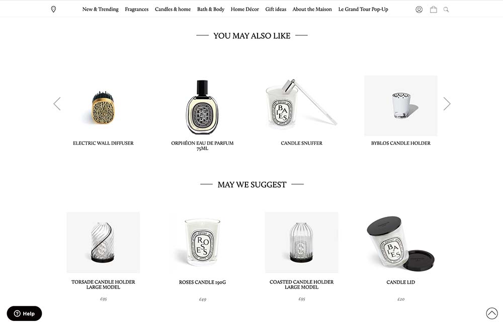
Adding a 'You may also like' section with related products can be powerful. Here on Diptique, the 'you may also like' section features similar products to the one I am looking at, so I may explore some other possibilities if I haven't added this product to the cart yet.
Their 'May we suggest' is also excellent as it has upsells like a candle wick trimmer and a snuffer - things you probably didn't even know you needed!
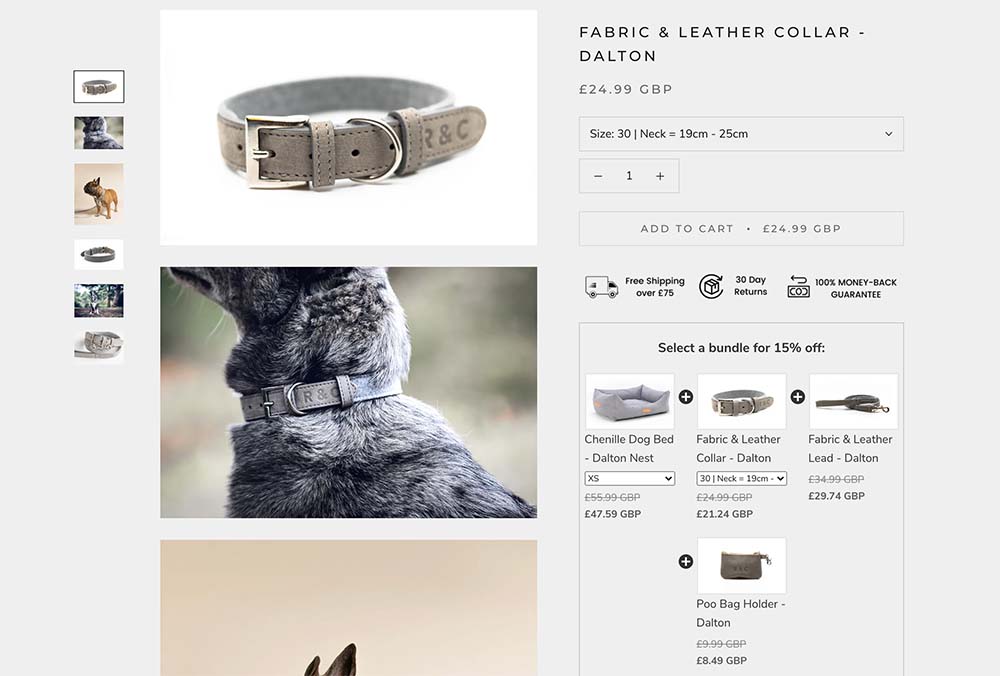
7) Bundles
Bundling like products together is a great way to increase the value of your orders. They do this well over on Ralph & Co.
8) Remove the social icons from your header
Once you get visitors to your site, you don't want to send them away and back down the social media rabbit hole! Moving your social media icons to your footer will ensure your visitor stays on your site for
longer and decreases your bounce rate, which is excellent for SEO. I also like to add them to the bottom of the contact page, where you can explain why someone should follow you over there. Put it under your form, though, so that they will send you a message before leaving!
9) Add a contact form to your contact page
Contact forms make it as easy as possible for your visitor; they can send you a message right from your Website, they don't need to think about what to write or guess what information you need, and their browser may autofill fields. Try to keep the number of fields to under five and only ask for essential information. Long forms seem like work and will reduce the number of messages you receive.
Using a mail to link may seem simple, but they send your visitor off your site to get distracted by something else in their inbox and possibly not sending the message or returning to your site. Worse still, the visitor's default email programme may not be the one that gets opened, leading to confusion and frustration, again resulting in them not sending the email. Another bonus of using a form instead of just an email address unrelated to conversions, but good for you is that you will avoid Spam as bots can scrape email addresses off websites.
10) Improve the speed of your Website.
Optimising your Website for speed is a whole other topic, but in a nutshell, you should check how quickly your pages are loading; you can do this by eye or using the GT Metrix tool if you feel that your Website is slow; then it probably is! Ensuring your images are sized correctly and using the right hosting provider will make an enormous difference. Also, if you're on WordPress, a plugin like WP Rocket will make huge improvements out of the box.
I hope this post has identified some ways that you could improve your Website for conversions. If you have any questions, you can get in touch on my site https://kellysparkes.com/ or over on Instagram https://www.instagram.com/kellysparkeswp/.
I also have a YouTube channel where I share WordPress Tutorials and Website tips that can help on any website platform. https://kellysparkes.com/YouTube
Kelly is a design-led Web Developer and WordPress expert, helping creative businesses translate their brand and message into a beautiful, responsive website, optimised to draw in and convert their ideal customer. She worked as a web developer and designer for companies such as Sony Computer Entertainment for over 20 years, but now has her own Web Agency creating websites for floristry businesses like Flowerona and Tallulah Rose Flower School and her latest project - the new David Austin Cut Roses Website.
Kelly is the creator of 'The Website Formula', an online course to empower small businesses to create and control their WordPress websites. In addition, Kelly has just launched a YouTube channel where she shares weekly WordPress, website and branding tips to help you start your website journey.
